What is the most effective marketing tool? A Content Outline.
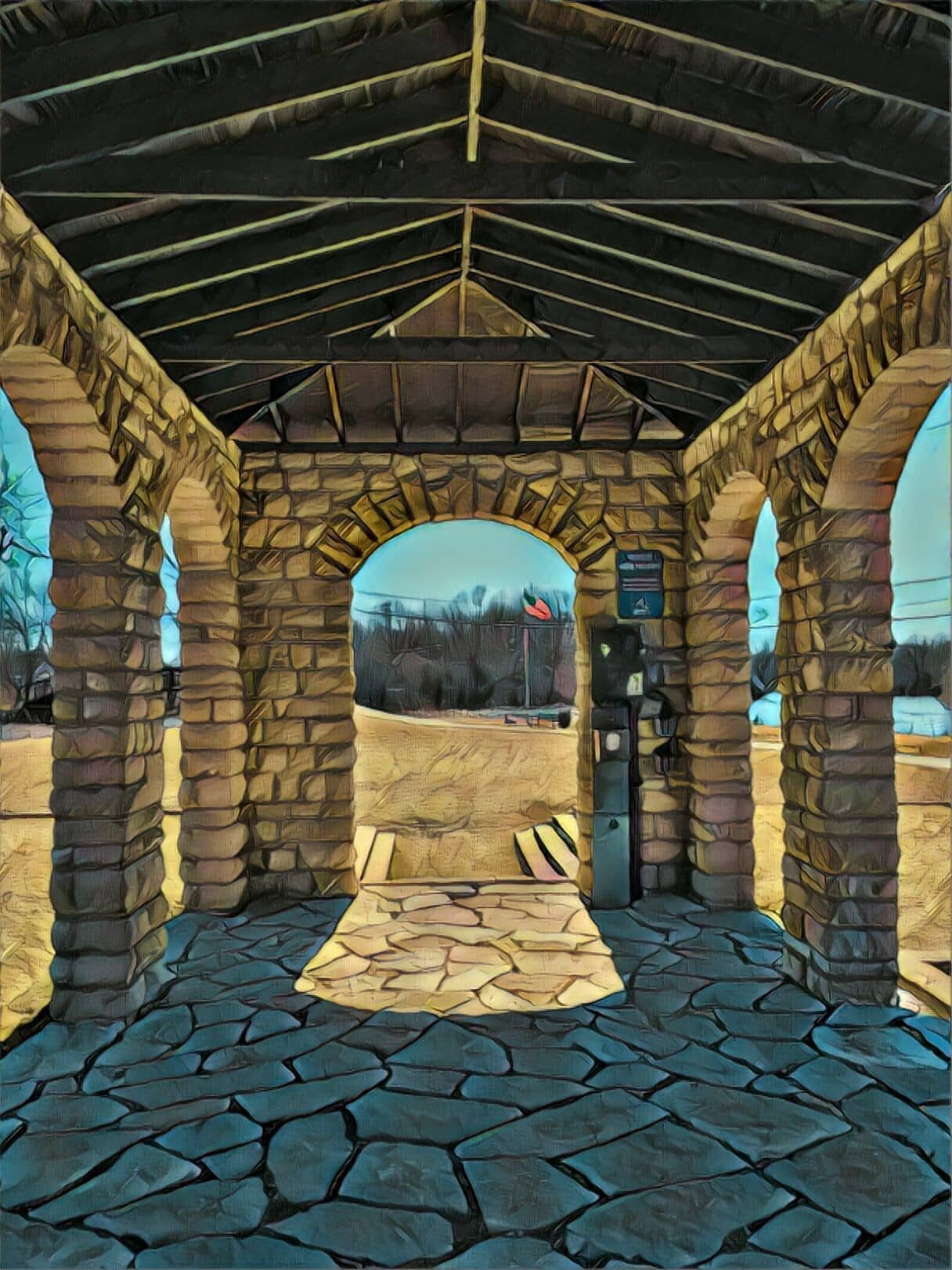
The Clark Island Pavilion is a good metaphor for good content architecture.
There’s no doors or windows, just a roof supported by arched walls constructed from local limestone.
The architecture is fully transparent and supportive for a variety of uses from resting bike riders in the shade and rain, to full-on Shakespearean performances with audiences sitting in the grass along the river, surrounding the pavilion, enjoying cheese and wine.
Your can approach your marketing content with a similar design.
[River sounds, birds, bike sounds, light rain]
Do a search for “what is the most effective marketing tool”
You’ll find a common list of about 10 popular tools:
Social Media Marketing and Management — like Hootsuite or Buzz….
Project Management tools — like Asana or Trello
SEO & SEM — search engine optimization & marketing — like SEMRush or Ahrefs
Email Marketing tools like MailChimp or Constant Contact
Content Creation tools like Canva
Collaboration tools like Slack
CRM tools like Hubspot
Analytical tools like Google Analytics
Pay Per Click tools like Google Ad Words
Conversational marketing tools like Drift
I believe one tool beats all of these as a core, foundational digital marketing tool and I’m calling it a content outline.
The best way I can describe a content outline is with a story.
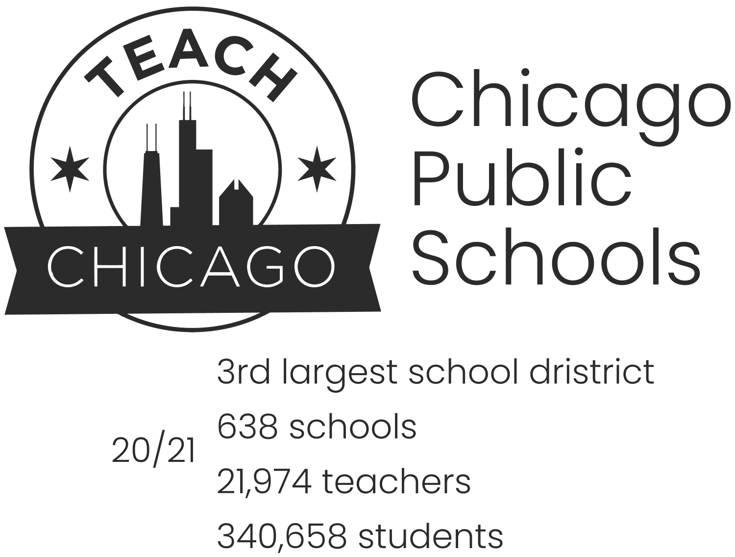
I was invited to build a micro-site for the Chicago Public School district, or CPS with the goal of attracting the best teachers.
Existing teachers who might be interested in switching to CPS
Students interested in a teaching career
Career changers - those who may be thinking of switching to a teaching career
CPS had been looking at what other districts where doing and wanted to stand out amongst those other options.
After having several meetings and discussions, plus conceptual studies on different wow factor ways to engage prospects to teach at CPS, I came up with an idea I’d not really tried with anyone before.
[ORBIS EARLY CPS ESTIMATES AND DIAGRAMS]
"What if we created a content outline?"
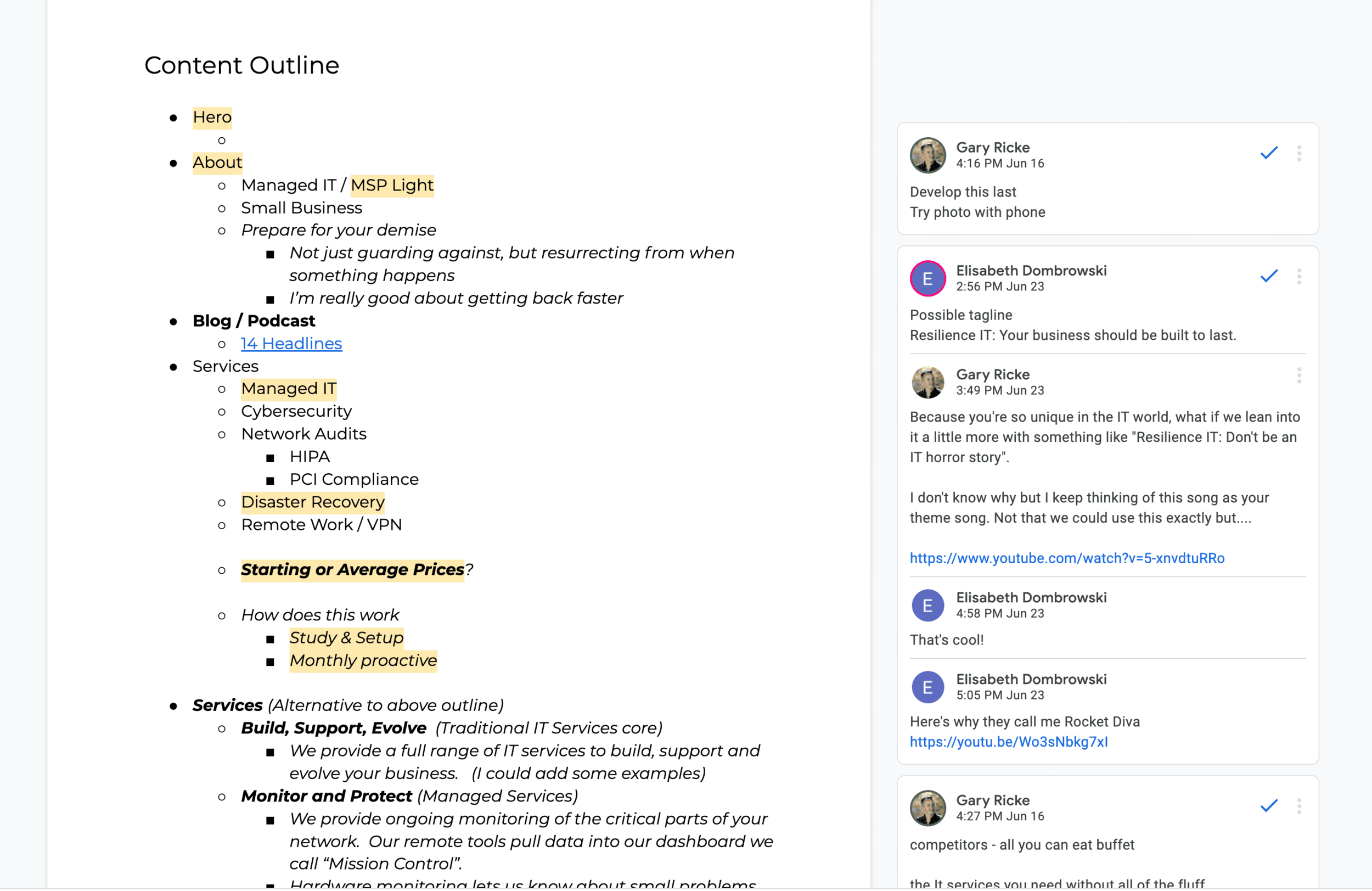
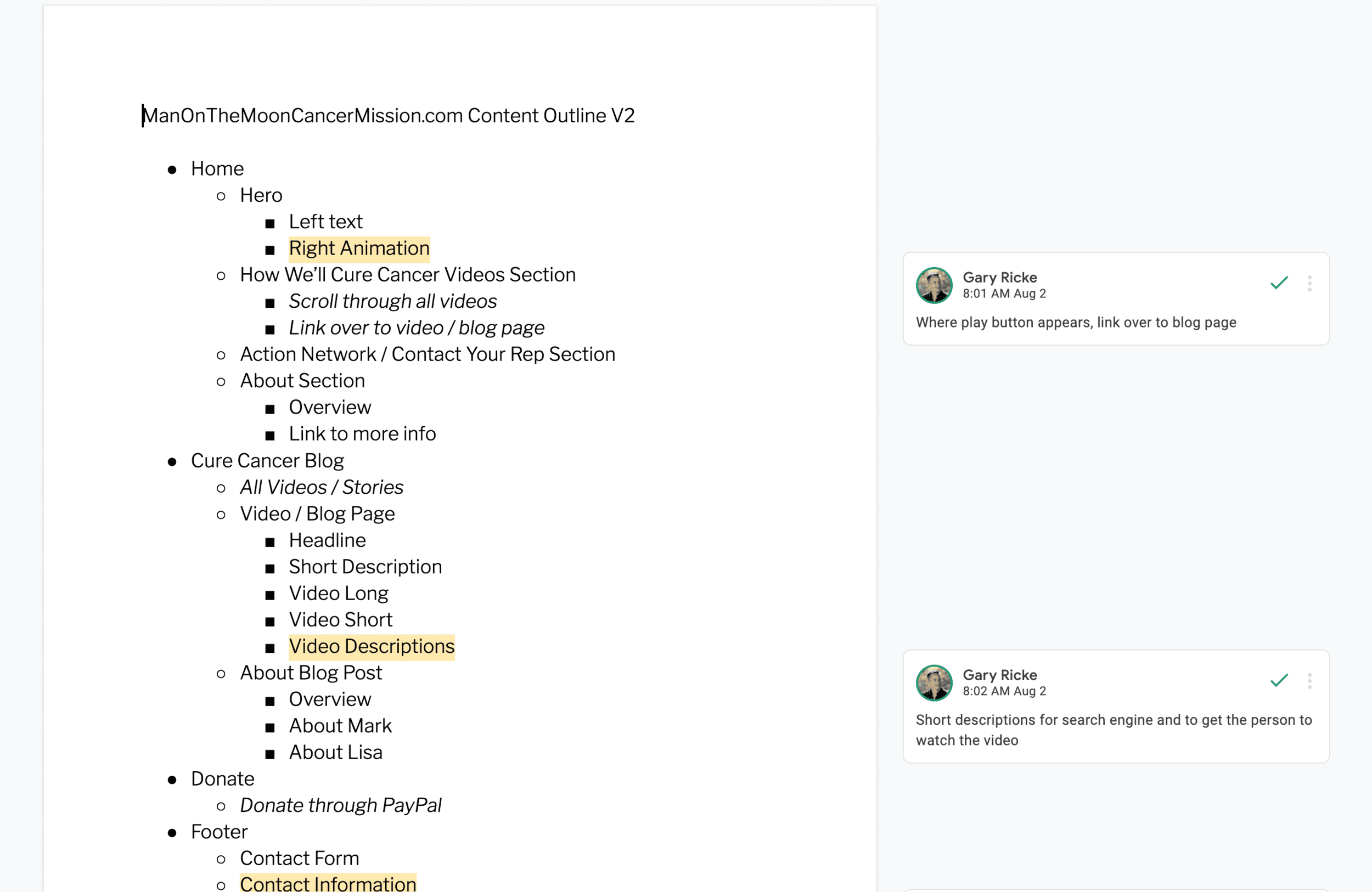
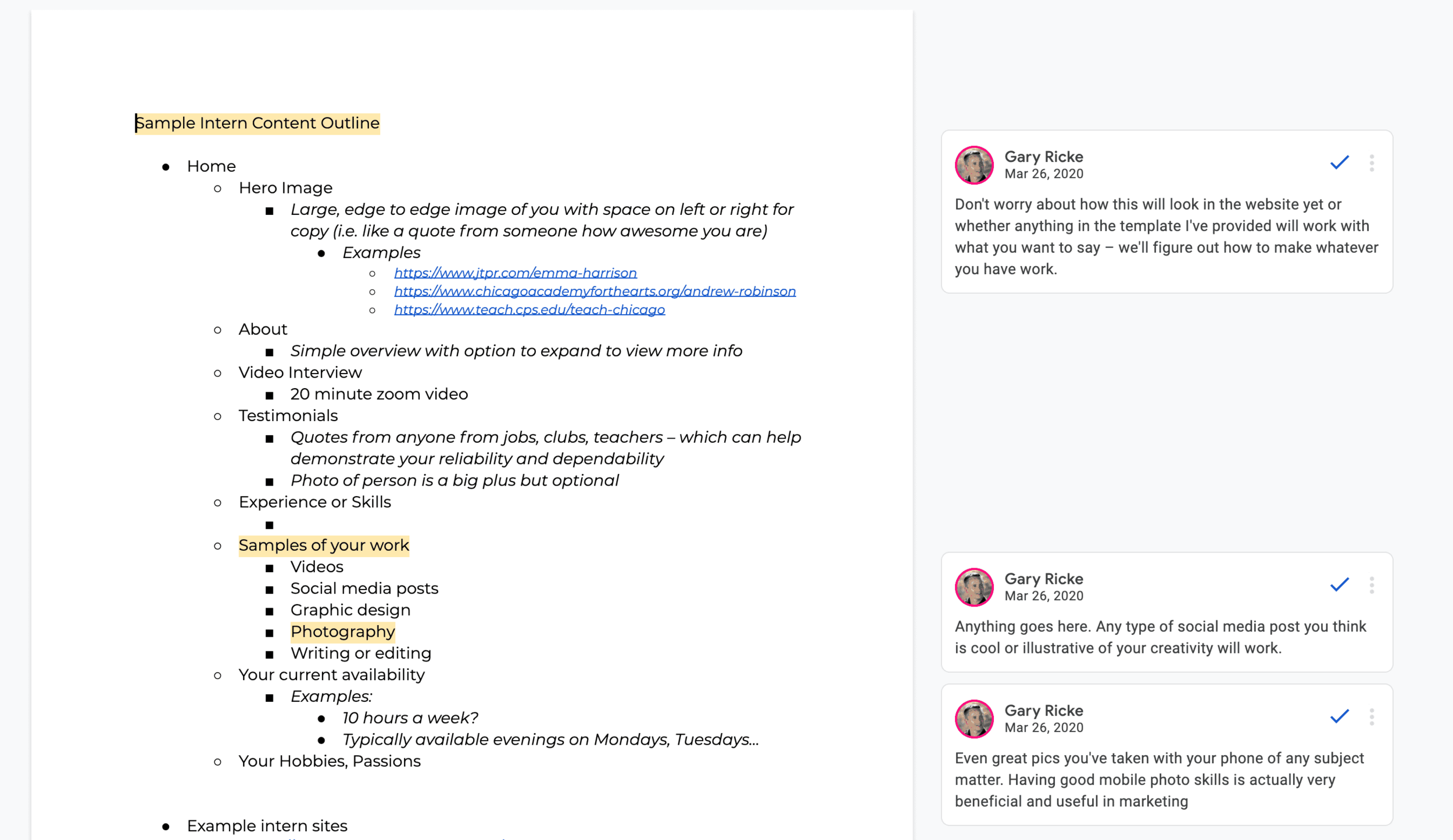
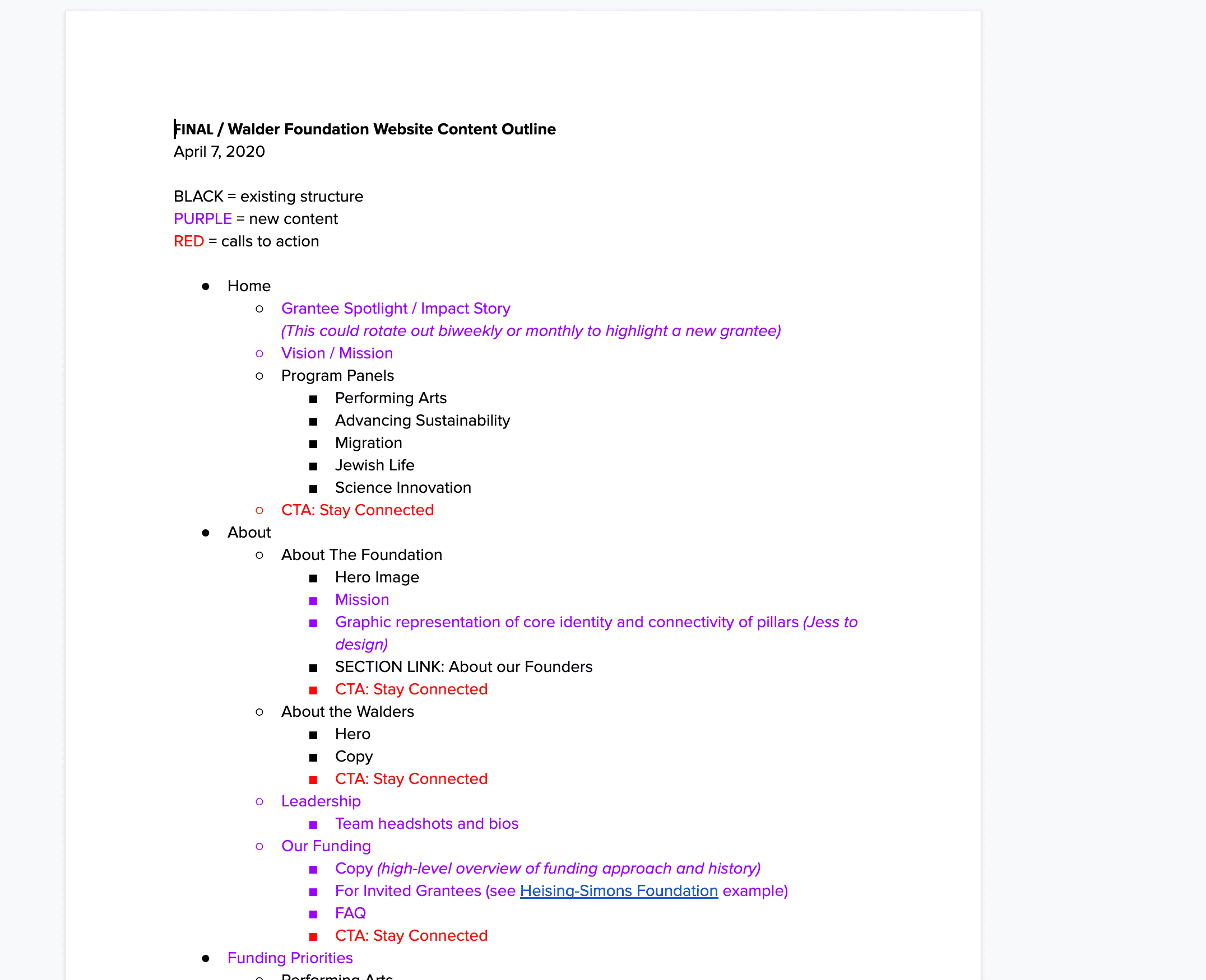
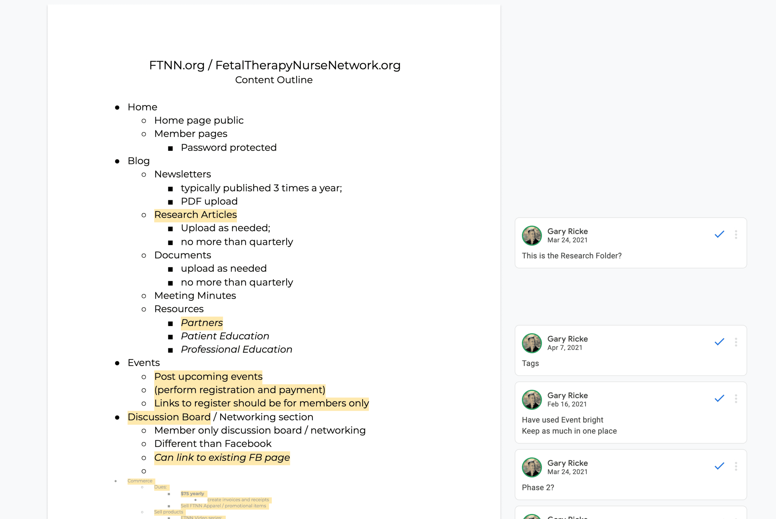
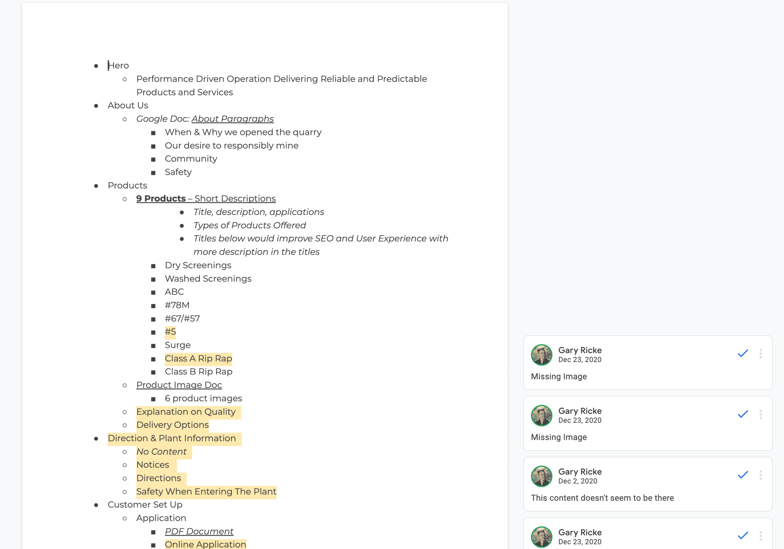
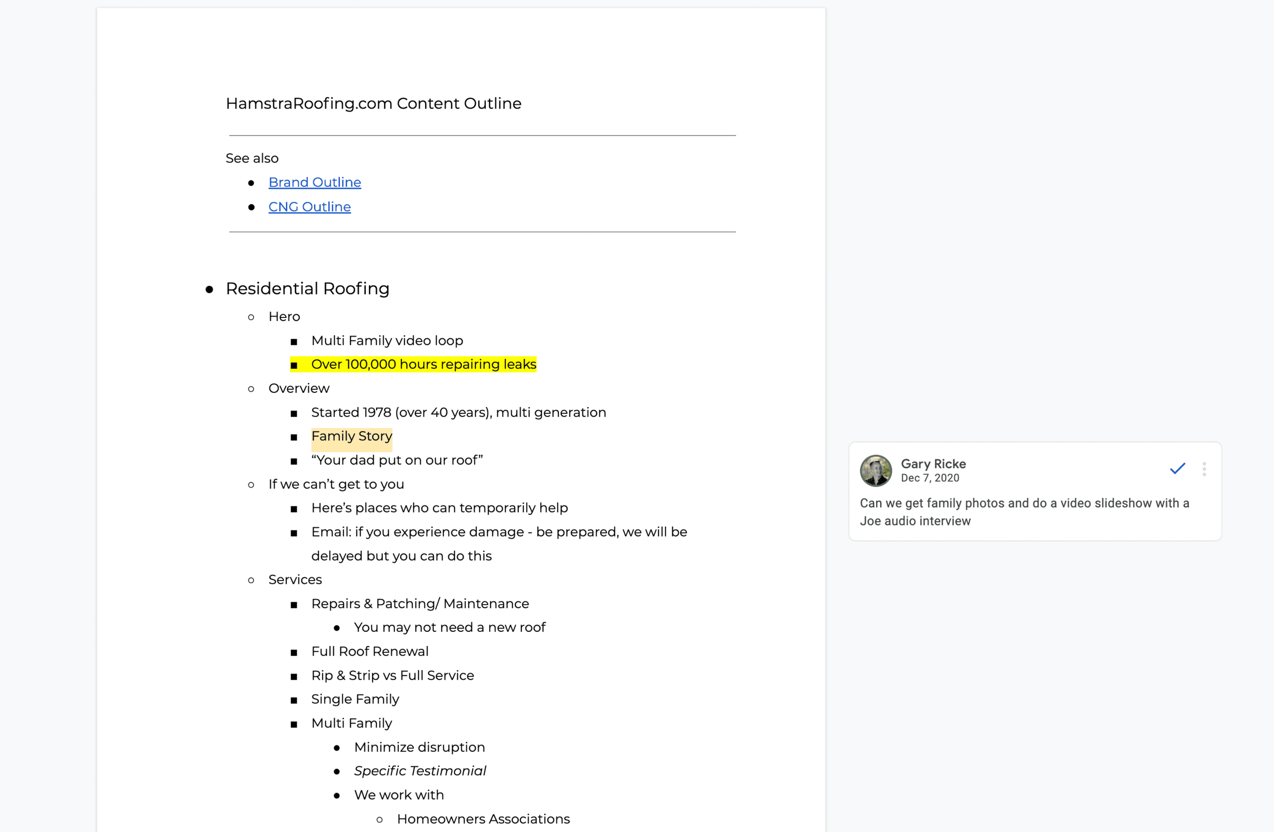
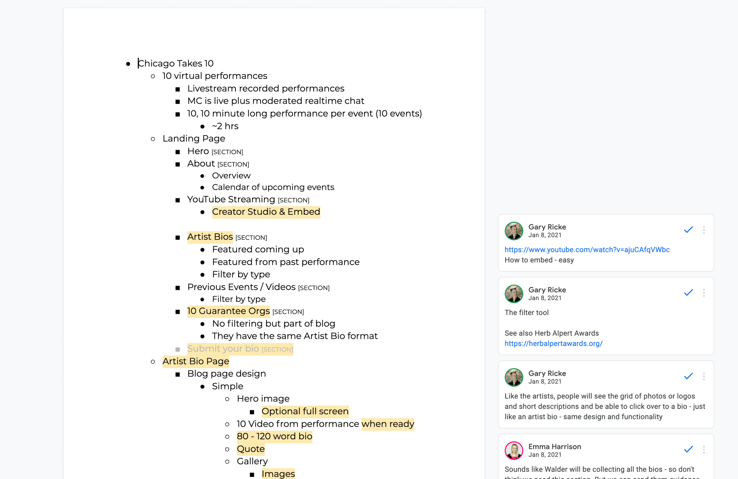
[content outline, figma, website side by side]
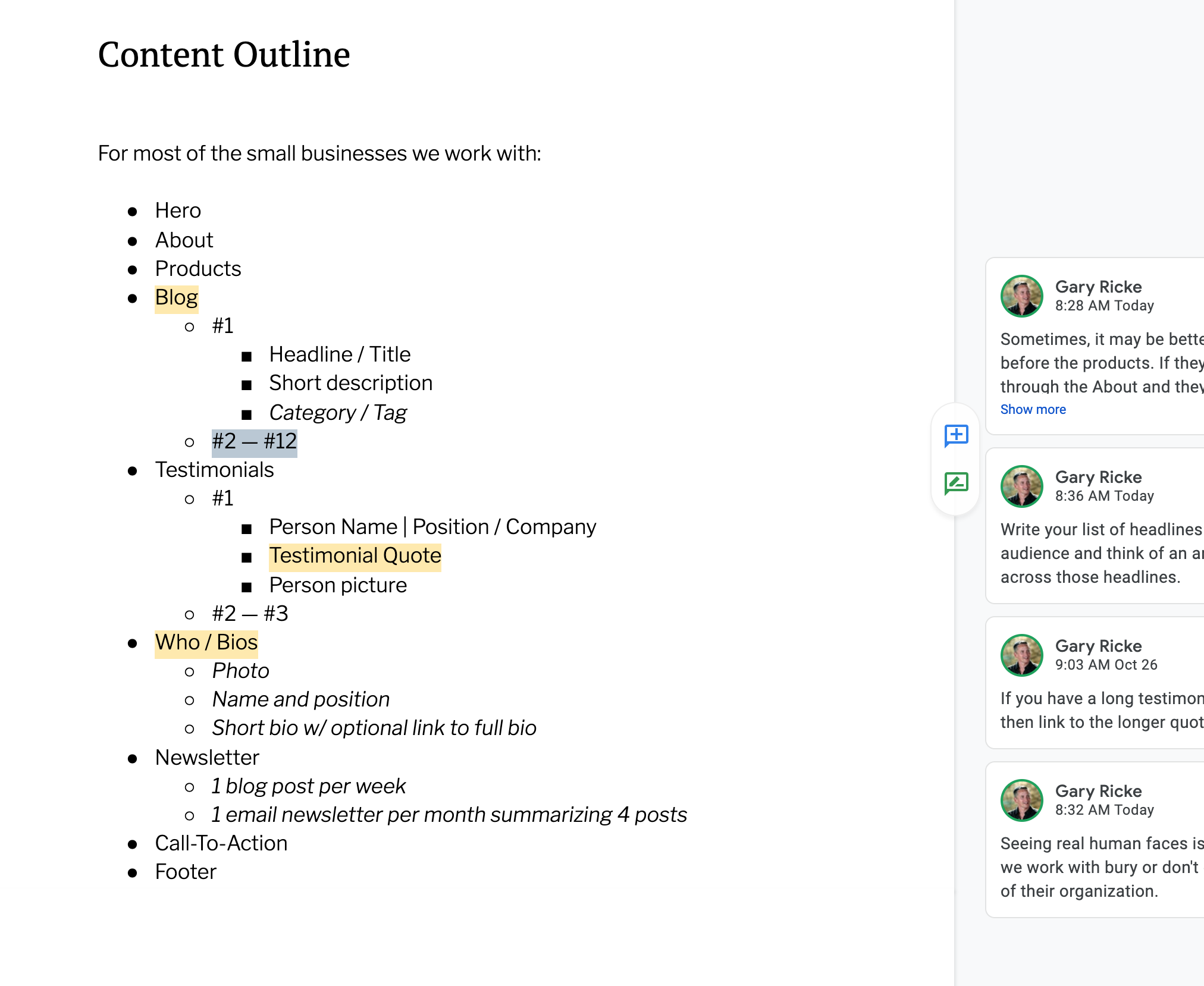
What I meant by a content outline, was a bulleted list of high level topics we believe each of the different types of teacher prospects we respond best to.
And, we should think of that outline in the form of a landing page for each of these types of prospects?
How to think like a landing page?
Landing pages are good when considered as sections of ideas one scrolls through — forget about any design aesthetics — think only of the order in which our information informs a prospect who doesn’t know anything about us.
Many have heard of landing pages but I tried to establish some ground rules on how to think like a landing page.
Think of a landing page as a long scroll of information, in the order in which someone has questions.
Forget what a web page might look like or any design aspects for that matter, think only of the order of things someone would want to learn about your program.
What are their questions and how would you answer them?
And, this is the other critical aspect: what do I want the visitor to do as they explore this information?
Imagine a landing page in sections
[Screen over - like imitation game]
Like, a first section that gets your attention and then assures you want to be here and continue on. This is often described as a hero section.
Often tightly integrated with the hero, but a new section in its own right is one explaining in more detail why you should consider us.
And then the next section: meet our awesome recruiters — they can really help you.
How about some upcoming events?
Some meet and greet opportunities.
You should register for an event (a first call to action or CTA).
“The audience actually wants to work for their meal. They just don’t want to know that they’re doing it.”
Finally, if your ready, let’s take the first steps at starting an application.
As soon as the entire team was thinking about the website in this way, the site kind of built itself.
Everybody was able to contribute when it's a bulleted list of information.
One of the most common comments I get during a kick-off meeting when we’re talking about building a new website:
“I don’t really understand how that works…” or
“I’m not really sure how we’d do that…” “I just know that when customer x needs this….”
But everyone can be an expert when it comes to a discussion on who we’re trying to talk to and what things we believe we need to provide them in order to connect with that individual.
The other instruction I supplied which was critical was,
When outlining this information, don’t limit anything.
Don’t think about how we’ll display it or serve it up.
Don’t worry about how big or extensive the content is (or even how small).
It doesn’t matter how large or small or what format the information is in, let me worry about how best to do that.
Once we see the outline starting to form, I typically like to help flesh it out with common questions.
Some examples:
For our events, we typically want them to fill out a registration.
ME: Do you collect money with those registrations?
When we collect yearly dues, the person who pays is often not the member and they may be paying for several members as once.
ME: Ok, then clearly we need to offer membership purchases independent of the membership system itself.
Get a copy of our sample content outline
Example Content Outlines
