How we build marketing platforms for small businesses
*Note: This article is ~70% complete with updates being made daily.
LU 7 OCT 2021 · Created 7 SEP 2021
Our marketing platform mission:
Build an audience and inspire them into action: calling us, visiting our store, buying our products, following us on social media or at the very least, giving us their email.
Provide this power to the smallest business owner: one. Design for scale.
At the core of audience building marketing is consistent content. In typical marketing circles, it’s called content marketing. Essentially you’re posting content regularly. And lots of it.
That content, that body of work, all lives at your website.
How do we make it easy to post engaging content regularly that draws people in?
We create a website that is easy to add a ton of content and that content is easy to navigate and organize.
We establish protocols for sharing that content through social media and email campaigns.
We design the website around best practices and quality standards:
Image quality: sharpness, low noise and download size (optimization)
Accessibility: device, speed, size and disability friendly
Authenticity: real people, real photography
Ongoing maintainability: Interns, tutorials, content asset organization
~subheadIndex-links
First, We Plan
We start with a content outline which outlines the information as we want a particular audience member to experience who we are and what we’re trying to say.
Or better yet, what we want to say about ourselves as the answers to our audience's questions, needs, pain points and desires.
A content outline has nothing to do with the website, social media, email or any kind of marketing vehicle.
With the content outline, we don’t think of pages or posts or navigation or design.
It's a raw, high level outline of the experience we want to guide a visitor through.
We use Google Docs to create that outline because it’s a cloud based application meaning we can get to it from any device. We can have multiple collaborators working on it in real time. We can review version history, add comments and then tie the outline to raw content assets: photos, documents, and videos.
The most important aspect of a content outline is having stakeholders review, contribute and ultimately approve the outline.
When you strip away the marketing design aspects, everyone and anyone can be a part of that plan.
Who are we trying to communicate with? What are their common questions? What information helps answer those questions.
Don’t think about how that information is presented or consumed — just bullet out what that information is and the order in which we want a person to experience it.
[Brand Outline & Content Calendar]
The only design aspect I like people to think about is that of a landing page.
What’s a landing page?
A landing page is basically a long scroll of sections of content that walk a person through a linear progression of information.
The old days of the web mimicked the idea of “pages” that people would click through — an about page, products page, what’s new page.
The new way, the landing page way, thinks in terms of scrolling through information which has been meticulously laid out and ordered so that as a visitor scrolls:
A: They want to keep scrolling because you’ve got their interest and then
B: If they are our ideal future customer, they become that customer the more they scroll and the better each section answers their questions.
The key is that we are guiding them and not allowing them to click away or visit a bunch of pages and building the story of who we are by themselves.
A website’s home page has always been a landing page and the top navigation generalized categories of content.
Consider removing the top navigation to general content. Consider building multiple home pages, each designed for a specific audience type and then getting those different audience types to their respective home page.
That’s exactly how my first Content Outline worked when I suggested it to the talent office at the Chicago Public Schools teacher microsite I was invited to build for them.
I provided this simple explanation of the landing page idea and sections answering questions for particular target audience types and then they outlined their website into 7 different landing pages.
It was exceptionally different from any project I’d ever worked on. Every person collaborating on the website design felt qualified in adding or debating content choices without getting stuck on the typical conversations of “how do we make our home page ‘engaging’, better than everyone else's, ‘cool looking’.
Those types of design athletics are much easier to manage when they are defined against an established and approved content outline.
Wireframes & No Wireframes
“A wireframe is a schematic representation of a web page, its content and behaviour, but without its graphic elements. Wireframes are used for arranging a website’s architecture and functionality, navigation between pages and even for running tests with users.”
Pretty much every marketing agency and website development firm will provide some type of wireframe stage where they produce a sketch graphical representation of what your site could look like.
As wireframes evolve into fully designed graphical representations and the visual guide for the website developer, this is where most, if not all projects get costly and expensive. And by expensive, I mean expensive for the life of your website.
At the furthest end of the spectrum, you have customers — presidents of companies, head of IT or marketing — owners, all specifying what they want their site to look like. They’ll look at sites they like and ask, can you make our site look like this?
How much did it cost to make that site look like that? How easy is it to maintain a site that looks like that? Most times, it’s impossible to answer those questions and unfortunately you don’t find out until you start actually building.
Then you have the pros who design sites at the agency you’ve hired. The problem is, most designers presenting website concepts don’t actually ever code the sites they design.
Most agencies still provide Photoshop or Illustrator concepts to a website builder to “skin” a content management system.
These concepts are poor representations of how an actual site will ultimately function, including how the site will work on a desktop, tablet and phones in a huge variety of sizes.
Worse, is that “skinning” a content management system to look like a designer’s vision without that designer having any idea on how hundreds and then thousands of content posts will run through that design is where website development costs start climbing exponentially.
What Is Content
Let’s revisit our mission: Building audiences with a lot of consistent content.
This is probably a good time to look at what content is.
Content is photos, writing, videos, audio recordings, image galleries.
Content is related information — easy to find and navigate information. Easy to share.
Content is fresh and current. It’s authentic — real, not stock photos. It’s content from today, not years ago.
Content is appropriate for what I’m looking for, when I’m looking for it.
Content is related information — easy to find and navigate information. Easy to share.
Content is fresh and current. It’s authentic — real, not stock photos. It’s content from today, not years ago.
Content is appropriate for what I’m looking for, when I’m looking for it.
Content is fresh and current. It’s authentic — real, not stock photos. It’s content from today, not years ago.
What I’m looking for when I’m looking for it.
If you’re a roofing company, have an email ready to go out when it starts raining. That’s when roof leaks reveal themselves and the best time to get in front of a prospect. Google Ad words can also be turned on locally where it’s raining.
Content is appropriate for what I’m looking for, when I’m looking for it.
Content has quality.
Sharp photos that download quickly.
Writing that gets to the point quickly and is easy to scan. No misspellings or confusing grammar.
Content has accuracy and has sources to back up assertions. It’s trustworthy without spin or exaggeration.
Good content is efficiently captured, produced and distributed.
Good content is well organized and easy to find for multiple collaborators including new people coming into a marketing and content system regularly.
Good content lasts. It has longevity.
Like an old black and white movie people watch over and over, good content should never go out of style. It may no longer be appropriate for current considerations but it should always be respected for what it was when it was produced and what it concerned itself with.
Good content transcends marketing and becomes a historical record that’s cherished over time. My favorite examples are videos and audio recordings of old-timers within companies.
Good Content teaches someone something they can use that makes their life better. Content can entertain and make people smile but the content that makes the biggest impact is that which someone uses, reuses and shares with others.
With this definition of content, how does a content management system, as the base of a website deliver content like this?
A Simple Content Management System
In short, think of a two-page website. A homepage and blog.
Or better stated, a landing page and a blog.
Think of the landing page as collections of summaries and teasers of the blog posts.
Then think of the blog posts as deep dives or even short and simple but focused posts that then
A: lead a person to more related information or
B: elicits a commitment from the visitor. Like, following us on social media, giving us their email address for future, personalized communications or contacting us directly to start dialoguing around our product or service.
That’s really it.
Underlying all of this body of content are mechanisms that ensure this content is accessible by every and any device — especially mobile and its indexable by the search engines.
How do we build this simple website?
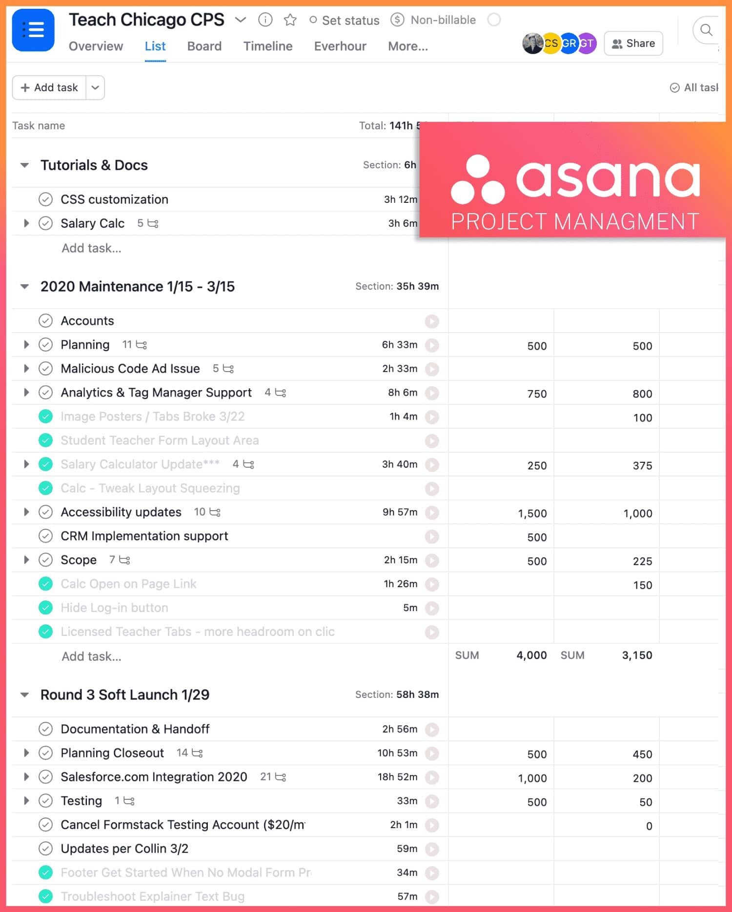
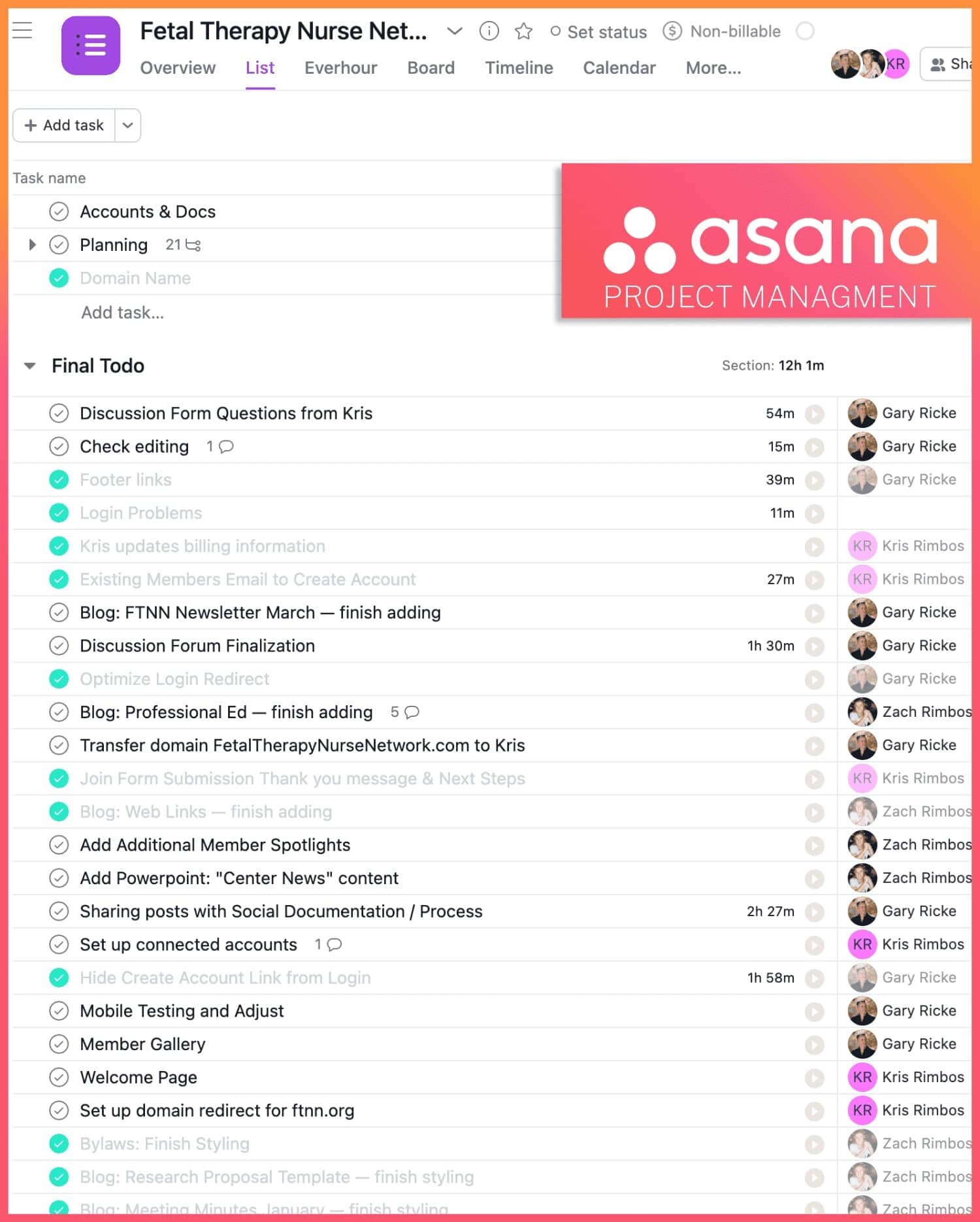
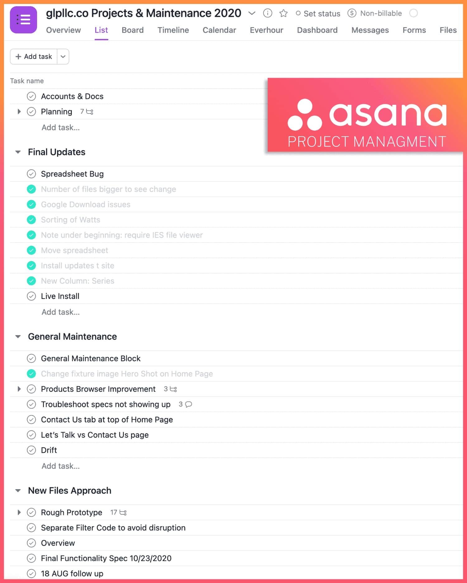
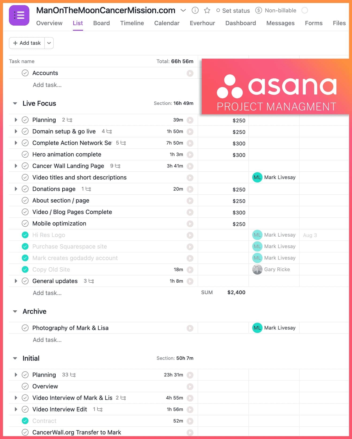
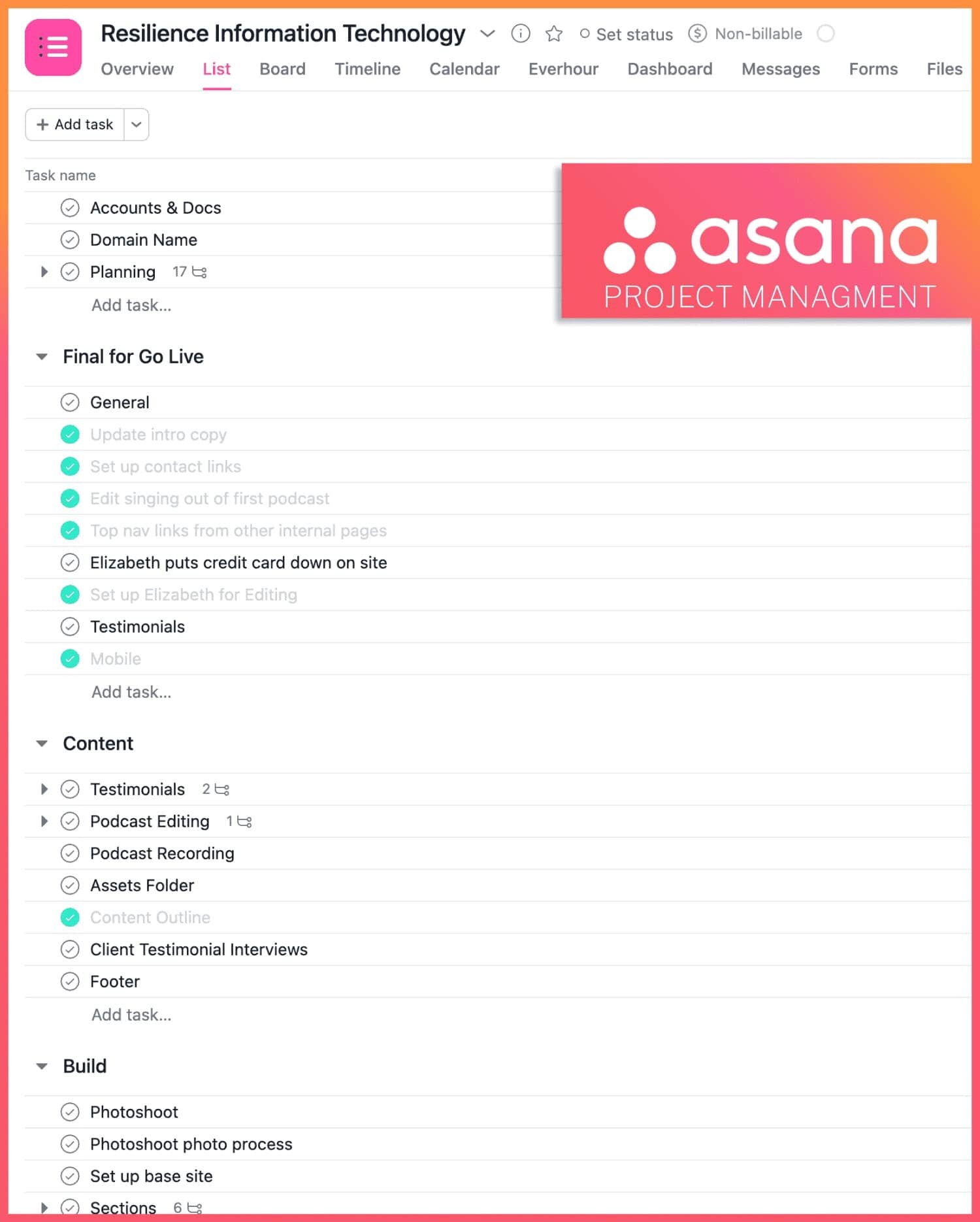
We start by building from the content outline a task oriented project plan in Asana.
A project plan converts our content outline into tasks, responsibilities, delivery dates and budgets.
This build plan can be thought of in 2 legs
1: The building of content assembled during the content outline stage (i.e. existing content assets) into functional landing pages and blog posts.
2: And the second leg: new content — new photography, videos, podcasts and written articles.
The build stage should come up quickly and with the idea that it’s designed for constant changes and updates.
Placeholder content can be standard at this stage since you should always feel that swapping images, videos and tweaking copy can be done immediately and endlessly.
The content capture stage should also be thought of as something that never ends. Zoom video interviews, product photography and event promotions and post summaries.
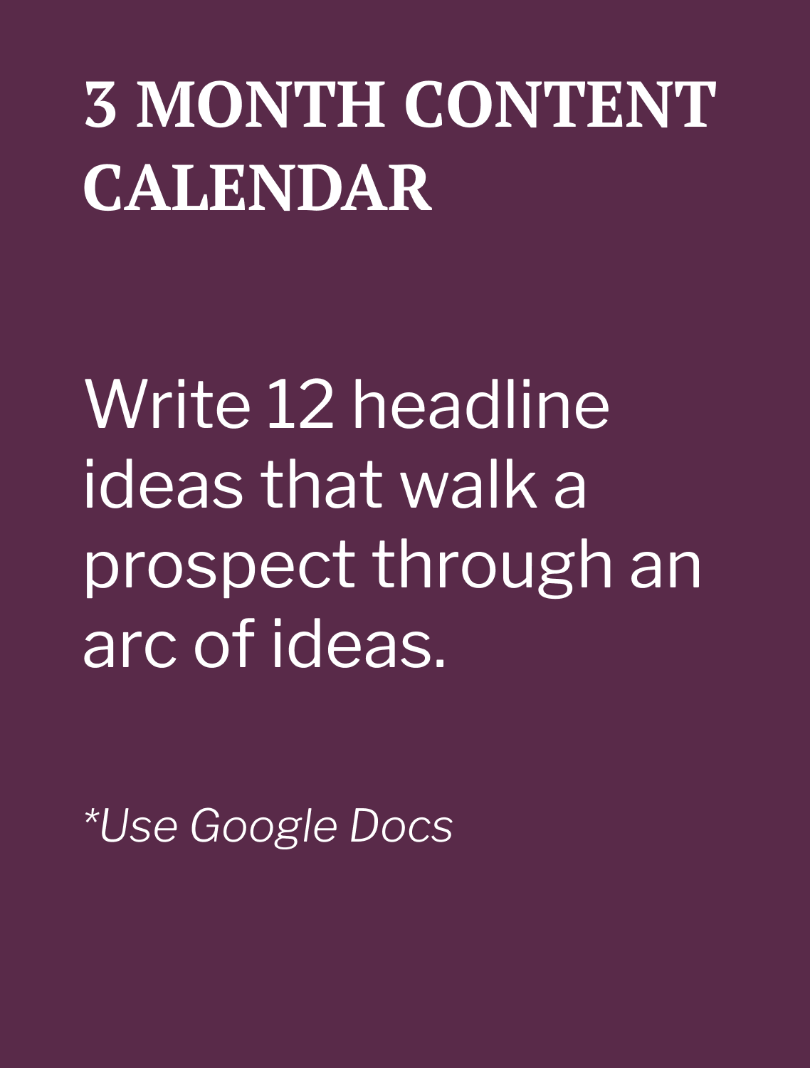
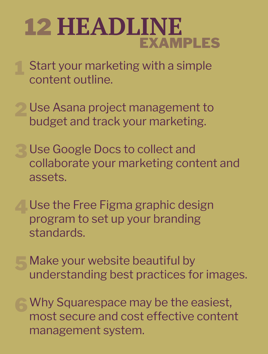
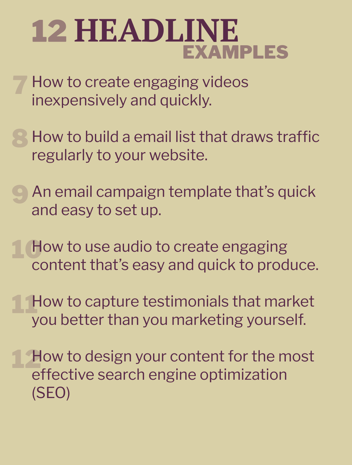
Yes, there’s typically a push with the initial build, but a 3 - 6 month content calendar should always be in the works.
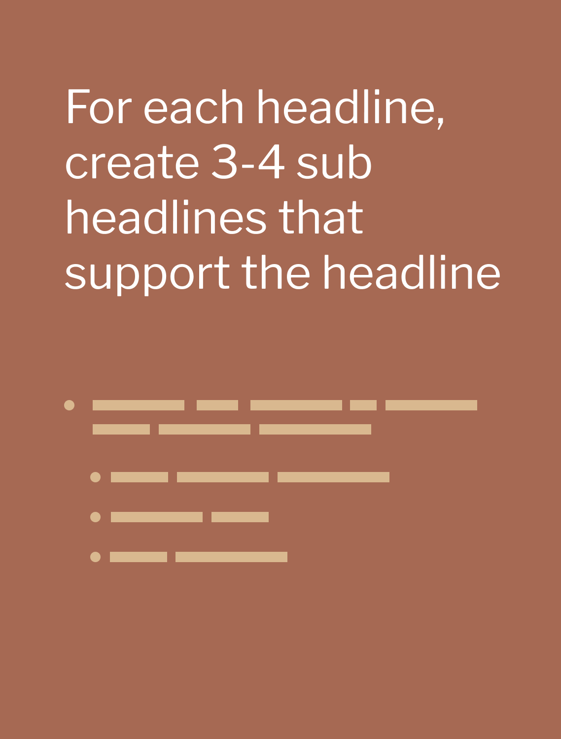
One social media post every week with a monthly email roll-up of those posts only requires 12 - 24 headline ideas.
Can you come up with 12 things you’d like to talk about that can walk a prospect though a theme of ideas over the course of those posts?
All of these ongoing posts can ultimately lead to a services page or an ecommerce store.
Social media should not be random, cool looking posts but a series of posts which are related to each other and walk your audience through a common theme and journey.
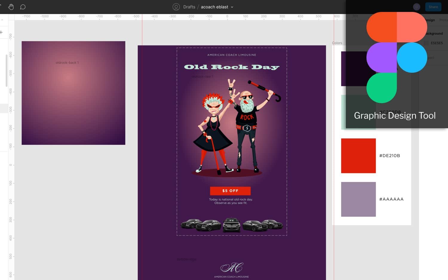
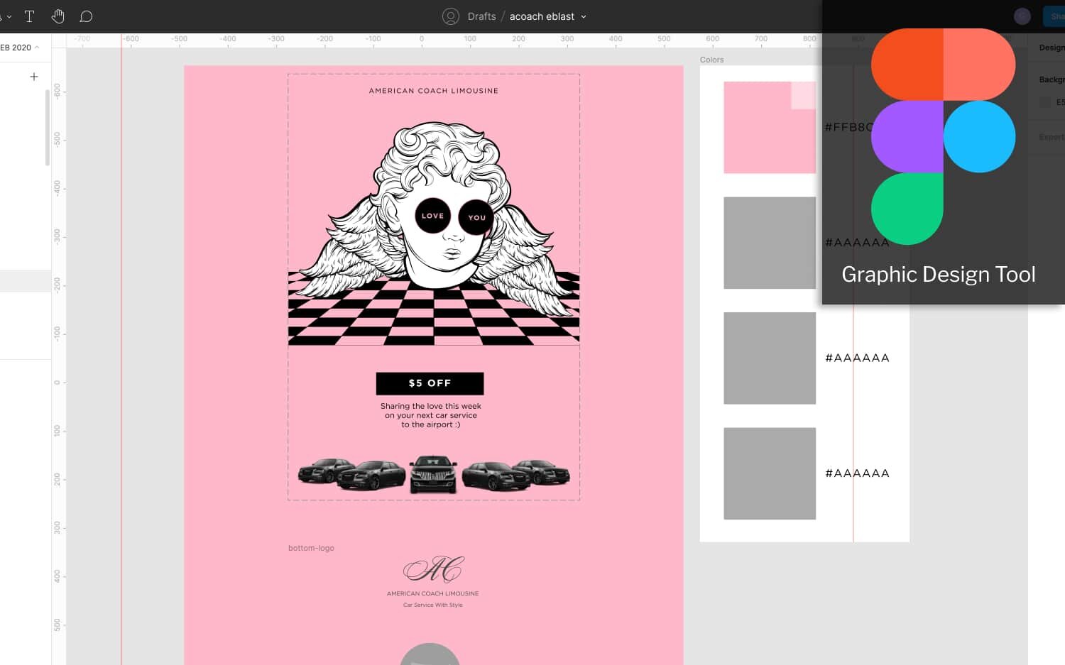
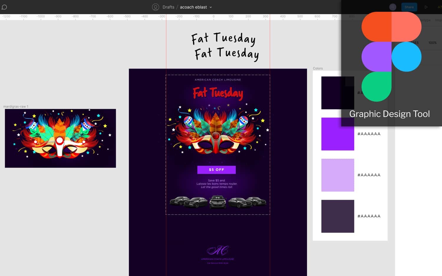
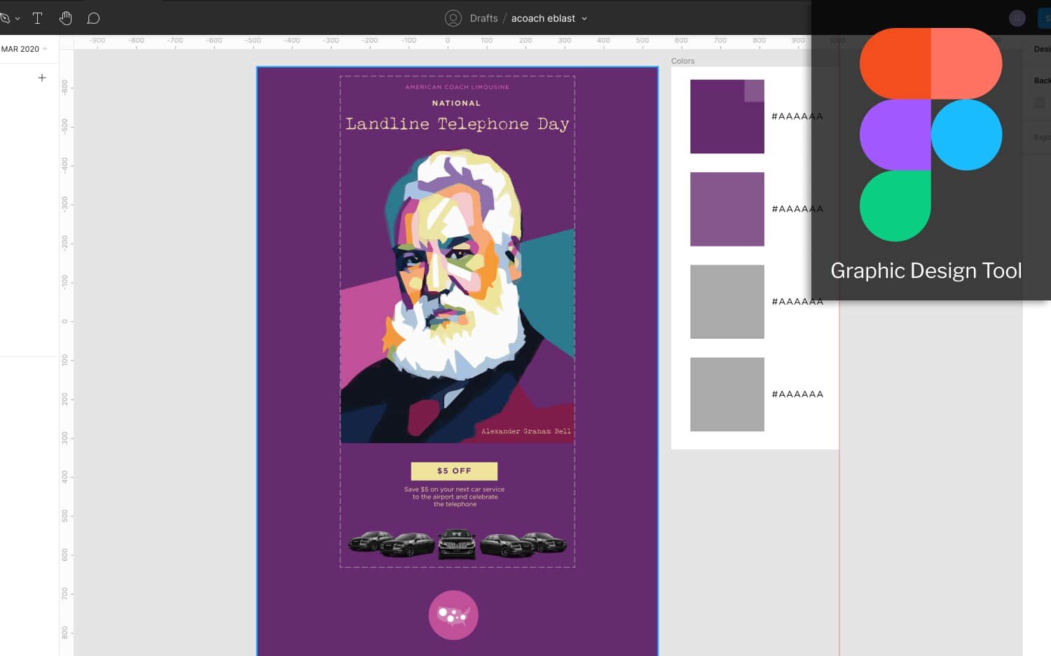
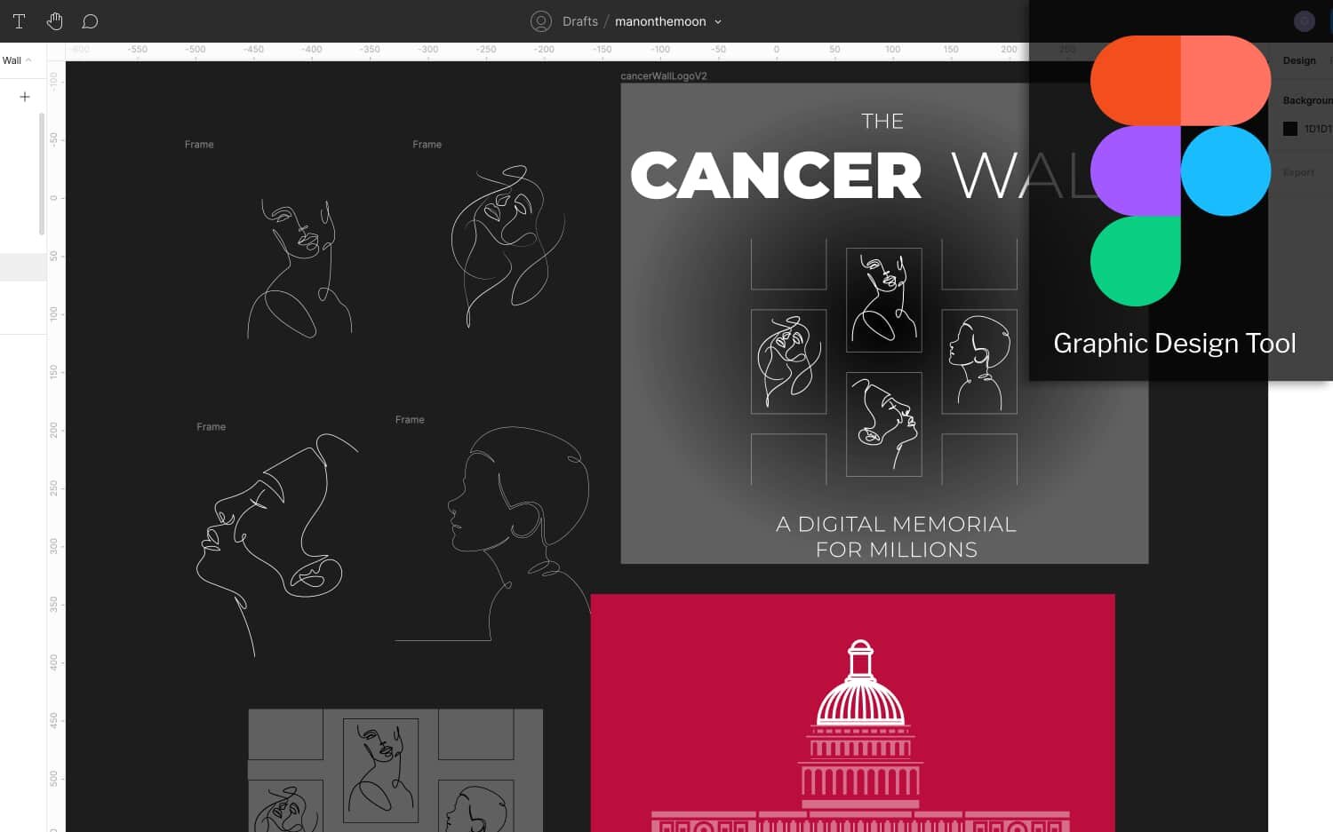
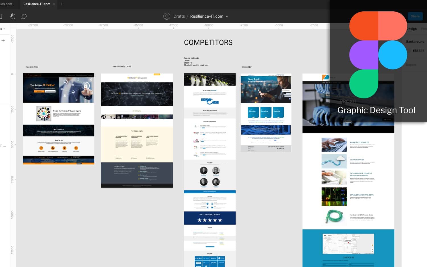
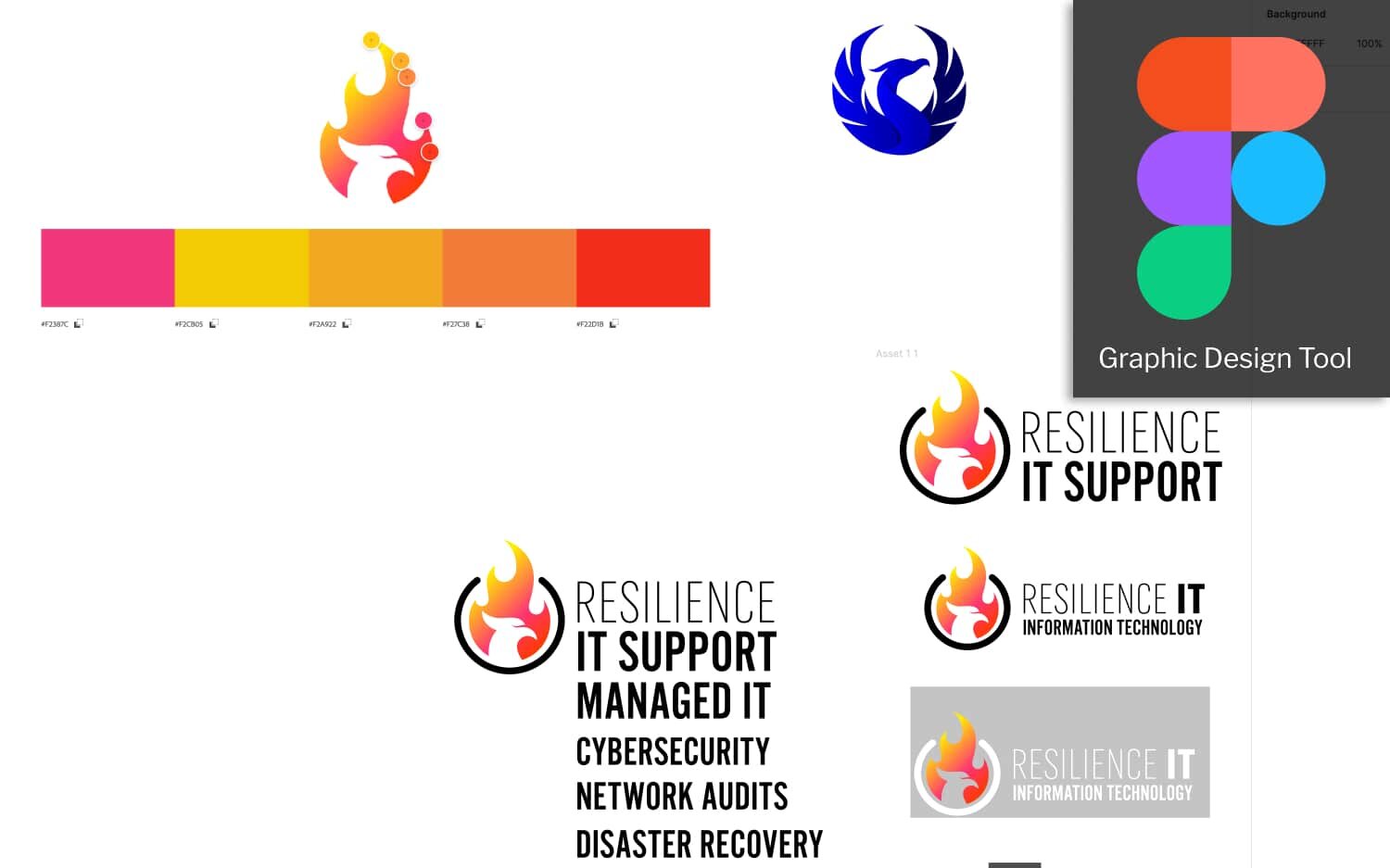
Branding & Graphic Design with Figma
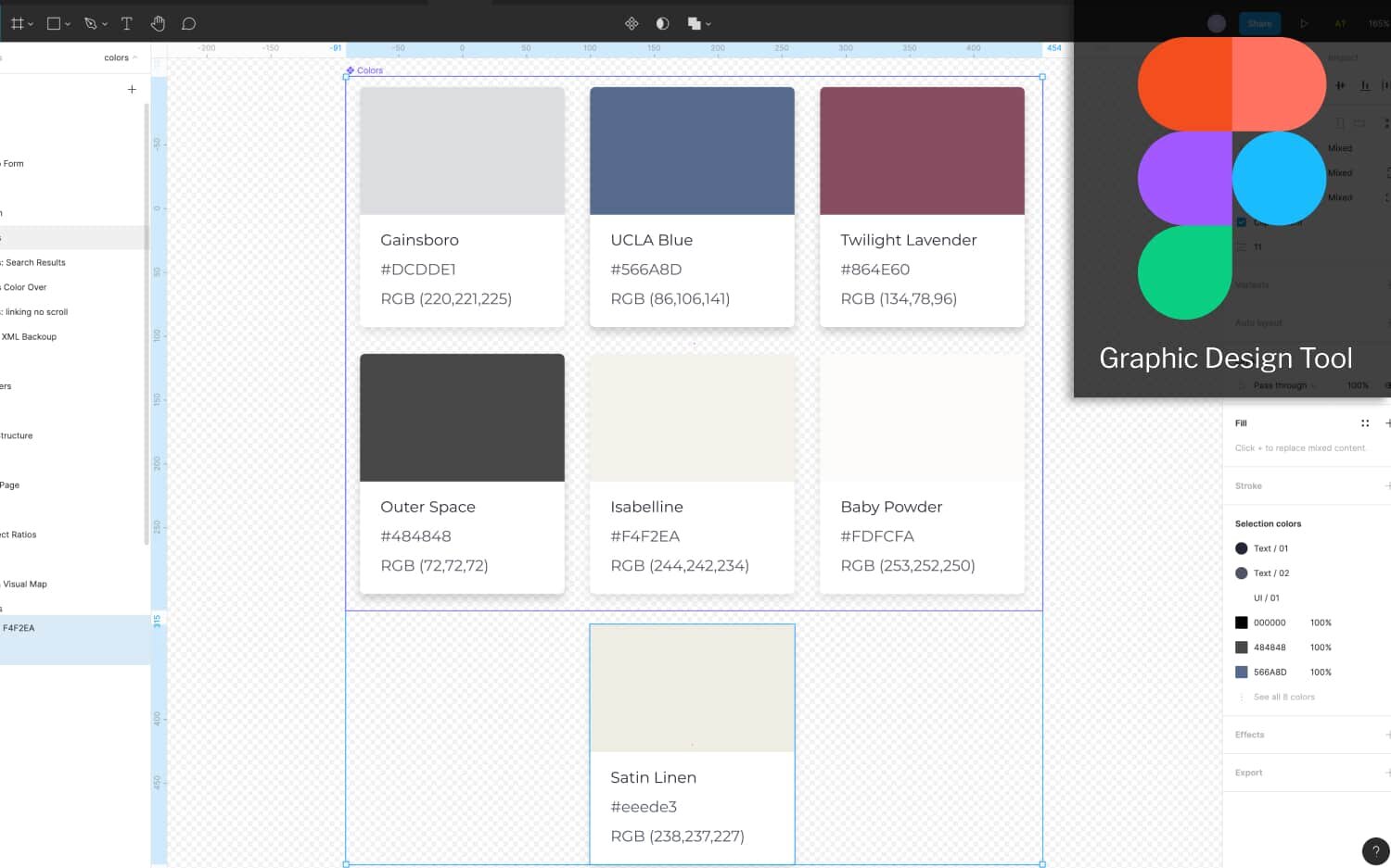
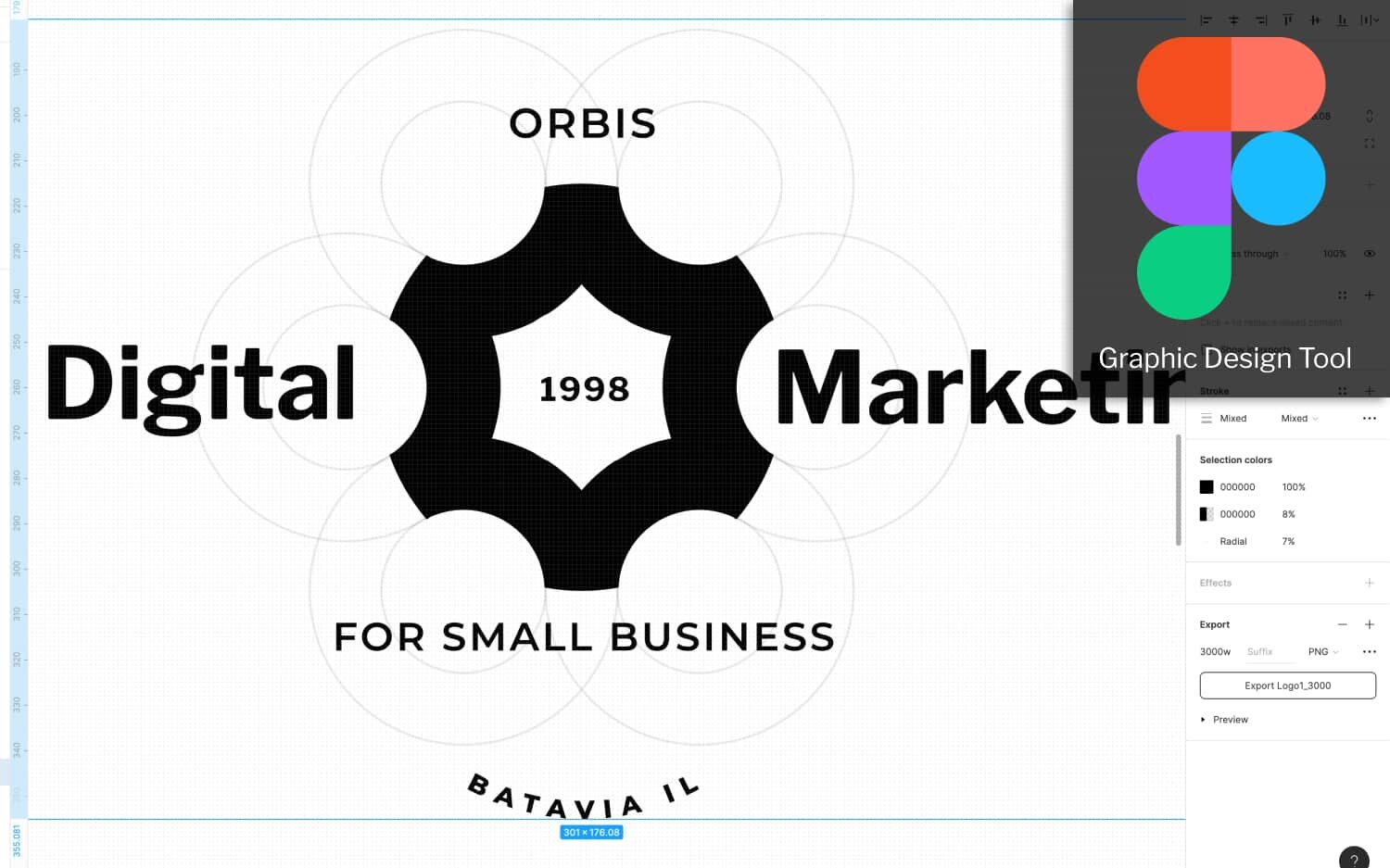
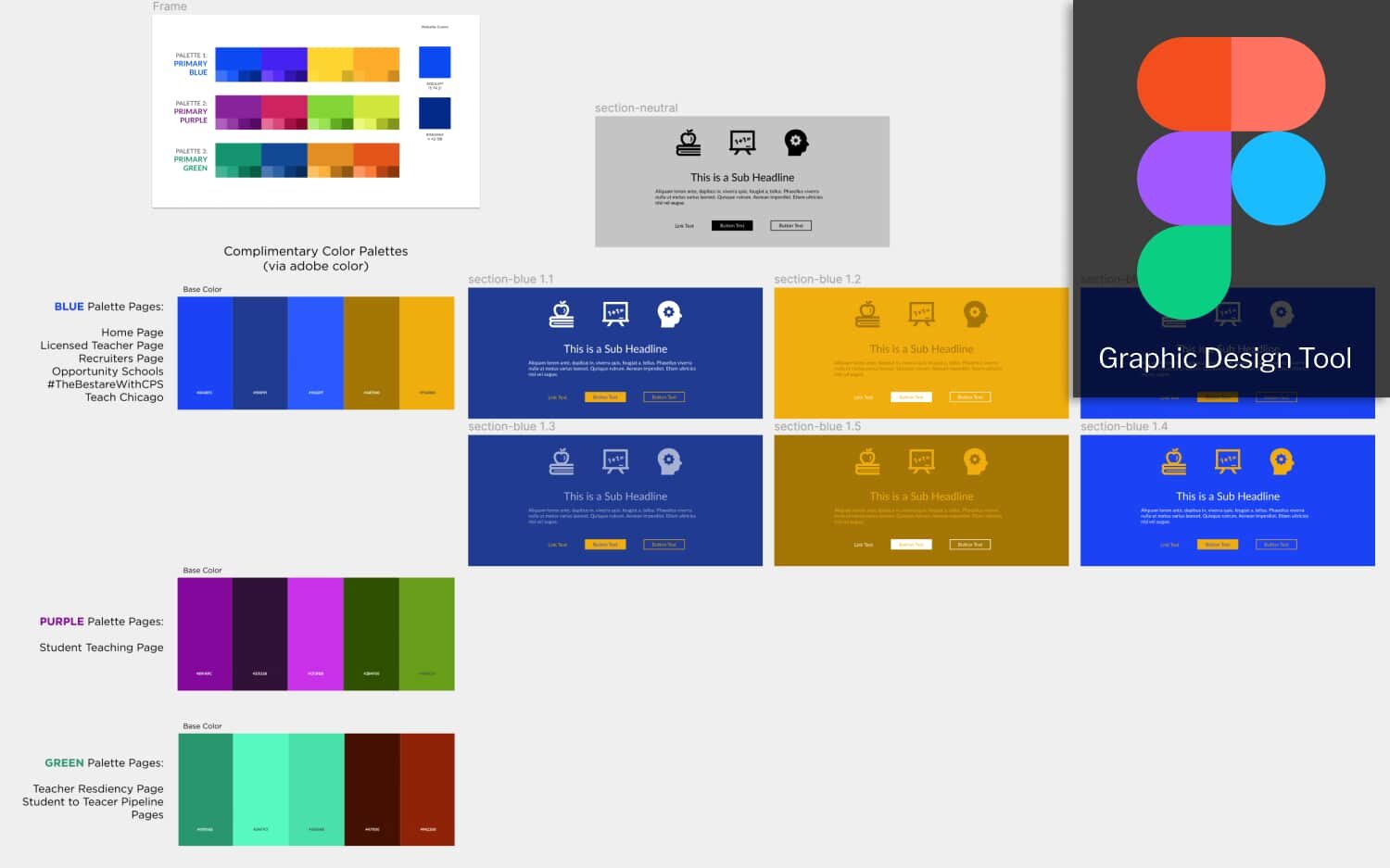
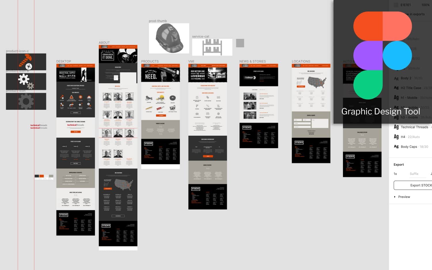
Figma is a graphic design program that runs in your browser and is free to use for 2 users. It’s a lot like Adobe Illustrator and Photoshop, only it’s specifically designed for digital design. It’s much easier to use than those programs and because it runs in your browser, it’s way more collaborative than those other programs — updates are immediate and in real-time.
We start in Figma by setting up our client’s logo (in vector format) and brand colors. We then move on to designing any icons and illustrations. We standardize images sizes, typography and templates for things like email blasts or blog posts.
What about cool animations, parallax images, flying monkeys?
“Your website is sometimes the only thing your customers see. You want that sucker to be so eye-poppingly awesome that it attracts backlinks, case studies ..., media attention, and customers out the wazoo.”
Humans like pretty things. I disagree.
Humans like things that are consistent and balanced. Patterns.
The way a website looks is based on two things: The Content and The Interface.
If marketing is a conversation that builds relationships, then the most abundant ingredient that facilitates conversations is content.
The most static element of those conversations is the interface.
Building a consistent and balanced interface which makes people feel like it’s pretty is an interface that is easy to read.
It doesn’t require a lot of visual searching — eyes darting all over the page, feeling distracted.
Words matter. Outside of the content, it’s the navigation, and simple prompts that help you along.
It’s thinking constantly about friction. What causes friction? What would confuse someone? Is it abundantly clear, outside of the content, what you need to click on to continue the conversation? Or even better, “Right about now, I’m imagining you have this question. Here’s the answer to that…..”.
“To validate that I’m answering your question, interact we me. With a click or finger tap, and we’ll continue building this relationship.”
Is there any point within our website where that’s ready to happen but it doesn’t because the text link isn’t making sense to us, or I can’t see that it’s a link — I miss it.
I miss it. I want it, but I can’t find it within your content, or I don’t believe you have what I’m looking for because I’m miss-understanding what I need to do next to learn more.
That’s friction and it’s ever present in the simplest of interfaces.
It’s far worse when a website is creatively adorned with animations, icons, graphic design — to impact WOW on it’s visitors, rather than increase their ability to make sense of how to move about our content.
I’m guilty of this to this day. I’m trying every day to remind myself, “No, Gar, this isn’t improving how quickly and easily a visitor will get to the point I’m trying to get them to.”
Headlines, sub headlines, paragraphs and links. Images, galleries and videos. Audio players and calculators.
Can anything you’re trying to say fit within those components? If so, then strip the interface back to the elements that allow you to organize groups / experiences / pages of those components and do not mess with that architecture. Go crazy with those components — aka the Content.
Go crazy with your content
Write long stories, shoot creative videos from your phone. hire a photographer, start a podcast, record Zoom video conversations, buy a 360 video camera. Publish. Constantly.
That doesn’t mean publish crap, right — we want it “so eye-poppingly awesome” and to the other side of that coin, we can’t obsess over the production to where we’re taking weeks and months to get available to people. How do we produce beautiful, engaging content and get it to our audience at a fraction of the time imaginable? That’s what we obsess over here at Orbis.
The most important conclusion I can make is a simple, no frills or fancy interface and then content that’s out of this world.
Anatomy of a landing page / home page
Hero image or banner video
About section
Promotion
Stories
Testimonials
Who
Products & Services
Call to Action
Footer
Anatomy of Everything but the Website
Social media
Email campaigns
SEO
Testing & Accessibility
Project Management
Content calendar
Content Asset Management
Marketing Gear & Software
Documentation, training & maintenance
About the image of the statue: “Self-Made Man”
I took the picture of this statue in Batavia which was created by Bobbie Carlyle which depicts a man carving himself out of a block of stone. I like the metaphor for companies creating their own marketing rather than having someone do it for them because companies need to be constantly communicating with their audiences. Relying on an outside firm is just too slow and expensive.
~subheadIndex-h2
Sources
Formilla.com · What Makes a Good Website: A Quick Guide to Website Design · 22 April 2019

