A Logo Redesign Nobody Notices
Hey there! Let’s upgrade this website logo without changing it too much so that other uses can change more gradually.
Kind of like how Mr. Disney upgraded me in 1939
So there you have it Battaglia. A work of Art! Like me!
Thanks Mickey
So, this is the logo on their current website which we’re rebuilding
This is the sign in their lobby
I’m noticing the 3 lines are different
And the bottom text is italicized on the sign but not on the website
Let’s adjusted those lines to flow from top to bottom
Next, sans serif font is easier to read on the web and
I noticed when at this client’s facility that their desks are super clean and organized. Sans Serif is considered a cleaner look which helps communicate that.
Now, I don’t believe “Industries” and “Inc” communicate important information from a branding standpoint — so let’s leave make room for the elements that matter
And, to that end, the words “Mechanical” and “Electrical” are the two most important words for someone meeting their brand for the first time so let’s make sure those are the most important
and let’s keep using the lines but put them to work balancing the logo and accentuating the key words.
A quick adjustment to the color palette — brighten up that blue
And finally, let’s combine the drop shadow and the outline into a solid color perspective — making sure it works on a solid blue background
So there you have it Battaglia. A work of Art! Like me!
Knocking out email designs in record time with ChatGPT and image generation with Dalle, Bing & MidJourney
There’s one thing that is universally important for every business and one that’s universally important for every person and we’re covering both today.
31 years ago today, the first web page was posted. Check out this Dr. Seuss version of the story.
This is INSANE what I was able to do with this PDF! Extract structure and build an interactive data filtering and sorting tool - everything with a new ChatGPT competitor called Claude — all in less than an hour.
Sail through a day in the life of a quintessential, small american town rich in tapestry of an authentic 4th of July, from the tranquil morning to the fireworks-lit night sky.
On the eve of our nation's birthday I thought I'd share a project that transports us back to those days #4thofjuly
Last month I held my very first art exhibition of art I generated from pictures shot on my and then rendered with AI. Here’s the backstories behind the art.
A new study shows the potential impact of large language models on jobs and it’s not looking good for white collar professions.
Don't miss out on the game-changing --seed parameter feature in MidJourney, which allows you to refine your favorite creations — improve your AI prompt engineering skills with this short video.
Descript offers user-friendly audio tools for text-based video editing, significantly improving audio quality through Studio Sound, compressors, and parametric EQ.
Discover the RESTRICT Act's implications on national security and its potential impact on innovation, rights, and the marketing and communications industry.
MidJourney 5, the groundbreaking text-to-image AI generator, brings revolutionary upgrades, redefining digital art with enhanced realism, flexible aspect ratios, and a language workout that opens new dimensions of creative possibilities.
Learn how small businesses can not only survive, but thrive during tough economic times by focusing on customer retention and leveraging social media.
Users have been reporting all sorts of ‘unhinged’ behavior from Microsoft’s AI chatbot including claiming it spied on Microsoft’s employees through webcams on their laptops and manipulated them.
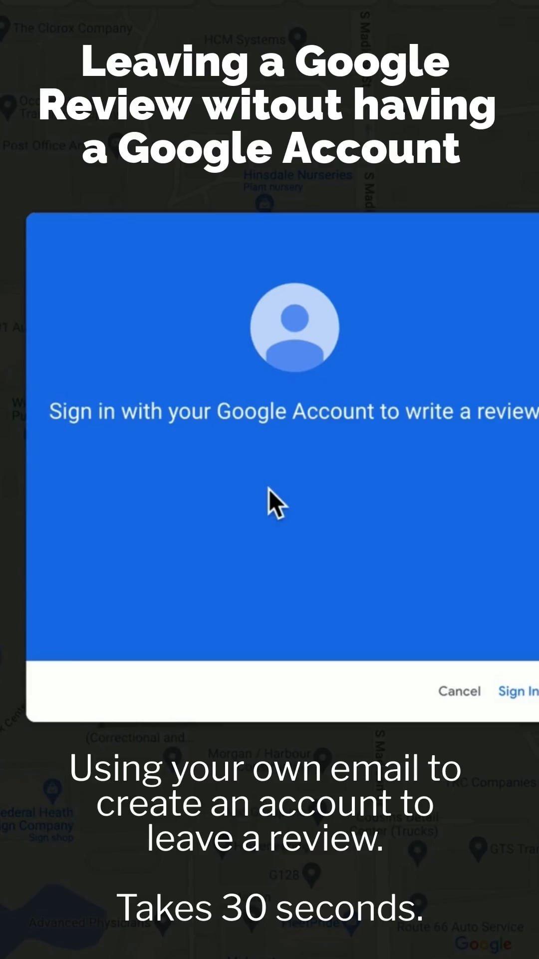
Don’t have a Google Account — this how to create a “shell” account which uses your own company email and then use most of Google’s Services.
Using AI to rebuild a super low quality image and then enhancing with another AI tool to bring the subject to the forefront.
Written by ChatGPT with the prompt: “Write a poem about a groundhog seeing his shadow and thinking about marketing, in the style of Dr. Seuss”
Google has made their Google Business manager harder but reviews are on the line so don’t miss this short tutorial on how to whip those reviews into shape.
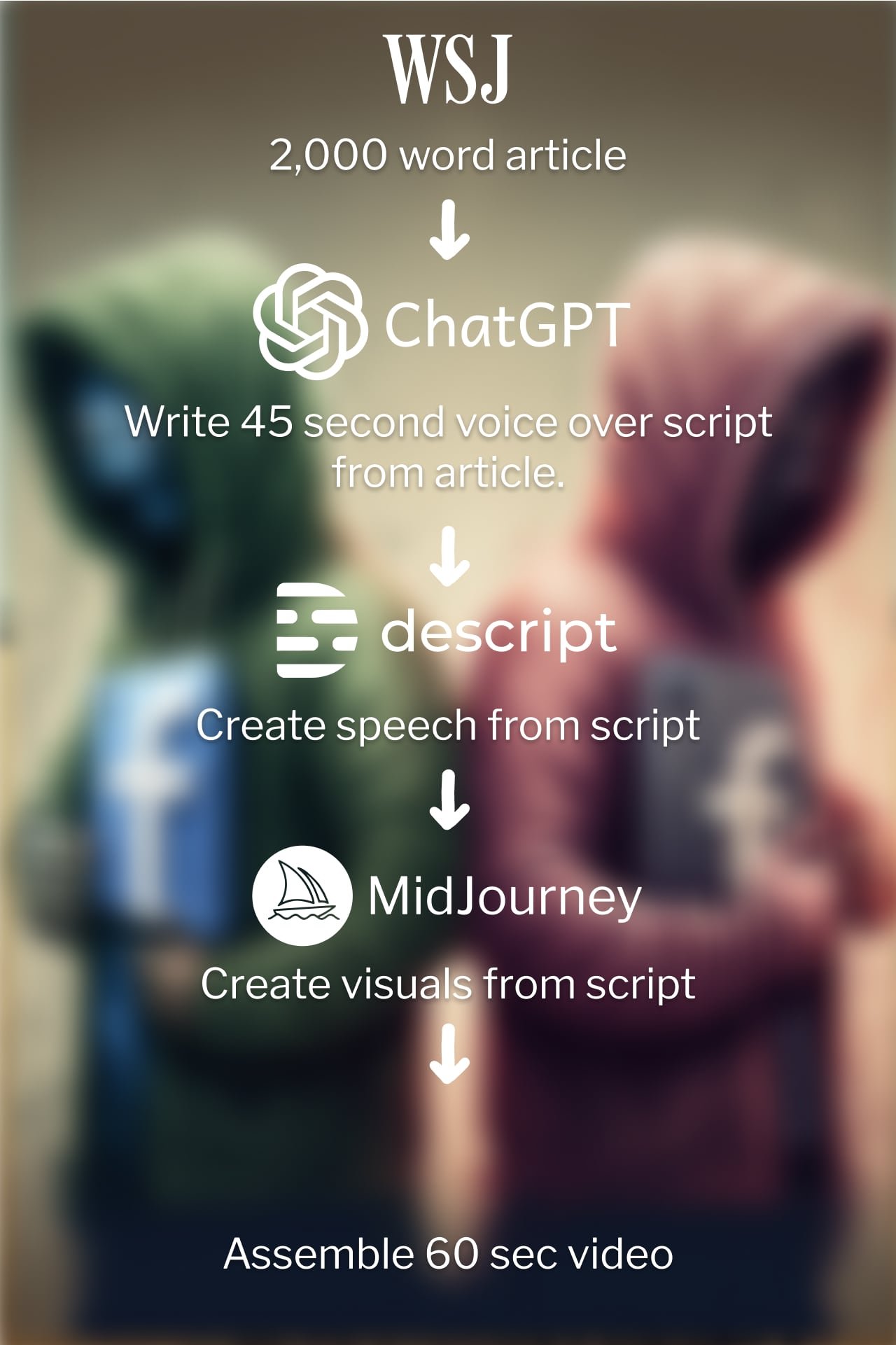
Watch a behind the scenes in how I turned a 2000 word article into a 60 second video with #chatgpt, Descript Overdub voice cloning, #midjourney text to image and Kapwing cloud video editor.
The Wall Street Journal reported last week that Meta is rebounding with AI after having the worst year in its history.
I felt like I was walking blocks from my home.
I’m now using AI tools every day on marketing projects for small businesses. Watch this 1 minute video to see 3 tools in action in this branding exercise.
I’m not a logo designer but I’ve had success using this process for several clients.
The same prompt for every image with the only thing changing is a style definition like an artist name.
And pitting it against itself.
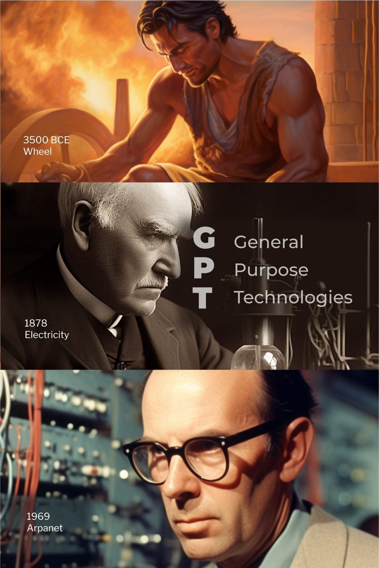
This is the best description I’ve found for what ChatGPT may mean for marketing and beyond.
From ChatGPT and MidJourney
I believe holiday posts should do more than just wish people happy holiday….. I believe this Thanksgiving post does that and is perfect.
What happens when you mix Halloween, Christmas and Marketing? Why you should be doing this in your marketing.


Exploring the mesmerizing world of AI art with MidJourney V6 and the impossible blend of Star Wars and 70s Bollywood - a pixel-perfect fusion that redefines creativity. It's not just art; it's a new reality crafted by AI.