Logo Redesign in 5 minutes

Summary:
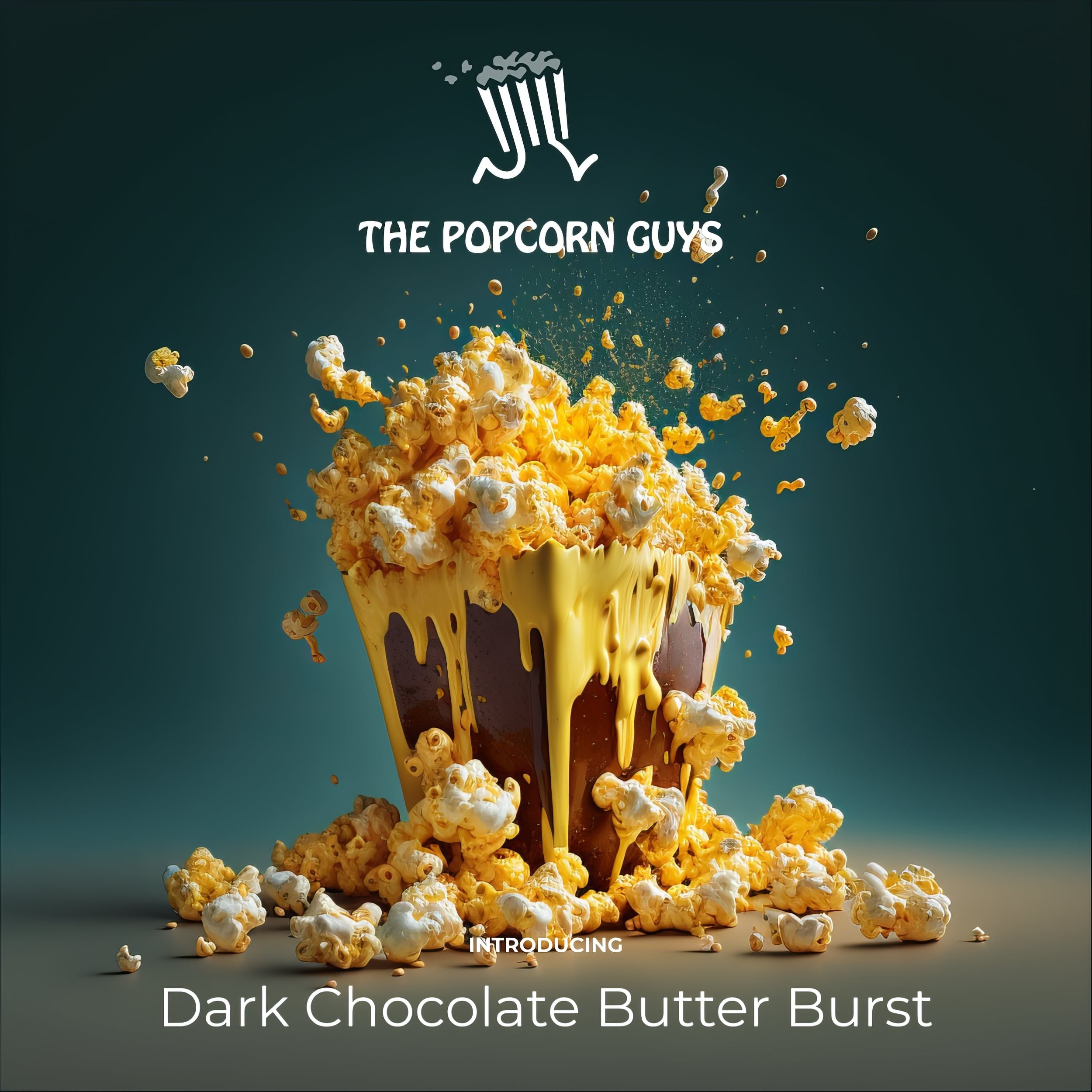
A group I mentor is asking for help with their logo design. I’m showing my favorite process for creating a logo quickly, demonstrating on their company called: "The Popcorn Guys."
I start by searching for inspiration on stock photo websites like Freepik.com and Shutterstock.com, and then I use a tool called Convertio.co to convert the chosen image to an SVG file.
I bring the SVG into a design program called Figma, add text and choose a font, and use a tool called Better Font Picker to make sure it looks good.
I also came up with a tagline using ChatGPT and then I check how the logo looks at different sizes and in different contexts.
Finally, I believe that the key to a good logo is not just the design, but also the content associated with it.
Steps:
Search for inspiration on stock photo websites like Free Pick and Shutterstock
Use Convertio to convert the chosen image to an SVG file
Bring the SVG into a design program like Figma
Add text and choose a font
Use Better Font Picker to ensure the font looks good
Come up with a tagline for the company
Check how the logo looks at different sizes and in different contexts
Emphasize that the key to a good logo is not just the design, but also the content associated with it.
Their first attempt at a logo — not bad but the biggest element: “TPG” doesn’t translate immediately to first time viewers and it takes some work to know that means “The Popcorn Guys” which is rather small and engulfed within the mark. How does this look at different sizes — especially when it’s really small?

The mark I found has some character and story built into it. The color scheme is also more traditionally popcorn — the red, gold and white combinations. “The Popcorn Guys” is also now the largest element. The mark (the logo without copy or tagline) is also clearly identifiable in different sizes and by itself.

Below: I also like to test a white version of the logo which is a common need when posting over a photo.

Notice how the popcorn or yellow part of the logo is now a white color at 50% opacity which maintains the multi-color design while still staying in the white color range and simultaneously allowing the background visual to bleed through with it’s colors.


Exploring the mesmerizing world of AI art with MidJourney V6 and the impossible blend of Star Wars and 70s Bollywood - a pixel-perfect fusion that redefines creativity. It's not just art; it's a new reality crafted by AI.